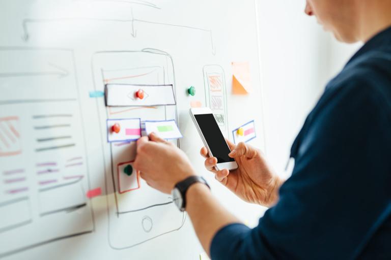
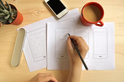
In a world increasingly addicted to top-notch mobile experiences for everything from commerce to communication, design of user experience (UX) and user interface (UI) is a critical success factor. The best mobile app designers figure out how to balance their creativity with the needs of an app’s particular audience.
Graphic designers transitioning to mobile design and development should start by building up a base of knowledge (or at least some familiarity) with some of the major front-end frameworks such as CSS/HTML. It’s also vital to know Apple’s iOS and Google’s Android (as well as the languages used to build apps in them—Swift/Objective-C for iOS and Java/Kotlin for Android).
True, a development team will likely do the actual app coding, but it’s still important for designers to know the capabilities of these technologies; that sort of knowledge can streamline both the design and production parts of the app-creation process.
“When it comes to your [mobile app] toolkit, a lot of the same concepts, patterns and habits of graphic design still apply,” Talin Wadsworth, principal designer for Adobe XD, the company’s platform for mobile app design, told Dice Insights. “If you've used one design tool, you can probably figure out another. The more you know, the faster and more accurately your designs will be implemented.”
Interactivity and prototyping play a huge role in the process, Wadsworth added. Just as a good book designer prints versions early (and often) to get a feel for how typography and layout will feel in the final book, a good mobile app designer will design interactive prototypes right from the start in order to overcome challenges as early as possible.
Mobile App Design Tools
Lucy Bonner, senior UX/UI designer at Small Planet, a New York City-based mobile app studio, explained how the digital tools that graphic designers use are constantly evolving, whether it be for designing or prototyping, which means gaining a sense of fluidity and adaptability when picking up and learning new programs is more important than perfecting one particular system.
“Right now people are using Sketch, Figma, Adobe,Principle, Framer, and myriad others, with new programs emerging all the time,” she said. “Figma is one of the newest rising stars I’ve been trying out, with its very handy team collaboration in real-time. But Sketch is about to release a new version that aims to surpass even that, so it’s an exciting time.”
Since designers are always considering features such as context-specific needs and accessibility, Bonner noted, they really just extend that same thinking to the mobile environment in order to address the unique attention patterns, thumb and finger ranges, tapping interactions, and other motions inherent in designing for phones rather than larger, more stationary screens.
“Doing research and learning about uniquely mobile features and user needs will help direct those skills, as well, because mobile technologies open up a whole new set of opportunities, too,” she said. “With built-in tools like motion and light sensors, geo-tagging, -tracking, and -fencing, ARKit, and more—not to mention the now-ubiquitous voice—designers have an even wider range of tools with which to work.”
iOS vs. Android
When it comes to the various operating platforms, Wadsworth noted, iOS and Android look pretty much the same: Apps organized onto a grid of icons and pages, red notification dots, and a core set of interactive gestures (the taps, swipes, and pinching to zoom).
However, in designing for each of these platforms, the details matter: Beyond the Human Interface Guidelines (HIG) of iOS, the Apple footprint inside of each app is relatively small, and most designers and developers are free to either use the “standard kit” or customize to push the boundaries of interactive design.
On Android, Wadsworth explained, the OS is a little more omnipresent in the form of each app’s navigation controls, status bars and standardized UI controls. An app with even some minor deviations from the “standard” can feel very out of place on Android.
Bonner also pointed out a few key differences between designing for Android and Apple products—things such as tabs, settings, and in-app navigation—while noting that these aren’t huge concerns. It’s always a good idea to go over Google’s Material Design for Android and Apple’s HIG just to check for guidelines, iconography, and patterns as you work.
“I think we all fall into one camp or the other, personally, so it’s good to refresh ourselves when designing for both, especially as both companies continue to come out with new tech and corporate directions that change the landscape,” she said.
Design is about solving problems, and the visuals should always work toward that aim. A clear, well-planned user experience forms the basis of a design, and that design complements, reinforces, and augments the underlying interaction models, flows, and structure.
“The biggest piece of advice I'd give anyone—beginner or pro—is to be curious in a deliberate way,” Wadsworth said. “For the majority of our day, we are immersed in the world of interactive design. We know when an app experience works, and when it doesn't.”
All good mobile apps are built on a strong end-to-end user experience journey. No matter how interesting or trendy your designs are, if a user can't be successful doing whatever it is they're meant to do in the app, it won't matter.
“Our superpower as designers is to be able to analyze and empathize with the world around us, and then apply those patterns and learnings to our own work,” he said. “The problems we're solving aren't new, we're just utilizing new platforms to communicate our ideas. The biggest gaps will always come down to experience, but if you use each new project to grow your skillset and refine your process, you'll be ready for any new challenge.”


